
Improving Service Learning
Improving students access to service learning
Overview
Improving the UW Medicine Service Learning (UWMSL) website enabled more students get connected to real life opportunities that support and enhance their learning experience.

Company:
University of Washington School of Medicine
Project Details
Project Type:
UX Design (Volunteer)
Role:
Lead Designer for homepage, donations page, and the learning opportunities page
Platform:
Web
Tools:
Semi Structured Interviews
Basalmiq
Figma
Design Timeline & Release:
February 2021 - September 2021
Released January 2022
Project Description
For students in any medical field, service learning is an integral part of their curriculum, giving these students vital hands-on experience to help them put knowledge learned in the classroom into practice. This hands-on experience allows them to better improve upon their skills and interact with patients to build up their other soft skills. At the University of Washington's School of Medicine, students were given a resource - a single website with potential opportunities. The only issue was that the students found the site poorly organized and lacked vital information, leading them on a wild goose chase. Making the process of finding these opportunities easier and clearer gives students more time to focus on furthering their abilities and participating in these opportunities.
Want to learn more? Scroll down to learn more about the redesigned service-learning website as well as the process I took to aide in its completion!
Design Process
Understanding our users’ needs
To better understand how people use the existing service-learning website, we interviewed current medical students about their current process of finding service-learning opportunities and providers on how they update their opportunities.
Through these interviews, we learned that providers had a hard time updating their programs and students were unable to find accurate information in an organized manner, having to shift through too much irrelevant information. Furthermore, there was no introduction to the website, so first-time users struggled to navigate the website. These issues led to each sector of the Service Learning team to manage their own spreadsheets and databases.

The original homepage of the UWMSL website had no context for users and low contrast
Original "Serve with us" page (once you clicked on a location on the homepage)

If you scroll down on the Serve With Us page, you get to different categories of opportunities

After 3 clicks, users finally get to a category of opportunities but cannot switch categories easily.

Opportunity tiles open a modal with limited information that was not always fully filled out.

The donations page had no context about the projects or impact it has.
Determining the guiding principles
Informed by our interview findings, the team's goal was to create a site that was easy to scan for our students and easy to maintain for our partners. Specifically, I had a few goals for the pages I was responsible for redesigning:
The homepage should provide quick access to the opportunities page while also providing a detailed introduction about the site for first time users.
The modal for each opportunity should provide basic information for students to determine if they want to go to learn more and sign up.
The donations page should provide context on the projects and its impact to provide donors with information on how their donation makes an impact.

Creating a user flow
As a team, we took our main principle of creating a site that was easy to scan and we started to work out what a new, efficient user flow could look like to find opportunities. Immediately, we knew we had to include a way to get to opportunities directly from the navigation and the home page for returning students. We also wanted to put more details about the program on the homepage and link out to relevant pages for new users to scan.
For the opportunities themselves, instead of making users click through 3 sets of screens leading to individual categories, we decided that we wanted to set up a filter, so users could view as many or as little opportunities as they chose. We also decided to make the previous modal smaller with basic information for quick scanability that took users a whole new page to allow flexibility of what information could be displayed.

Possible flows students and other users would take on our website to achieve various goals
Contextualizing the home page
As the team to split up to work on different parts of the website, I was first tasked with updating the home page. Since the original home page only included an unlabeled regional map, a first-time user has no context on what the website is, what to expect, and how to get involved. Furthermore, the color contrast makes it difficult to see some of the states such as Alaska and Wyoming as well as knowing that Eastern and Western Washington are two different regions in the School of Medicine.
I used my guiding motivations to provide quick access to the opportunities page while also providing a detailed introduction about the site for first time users.
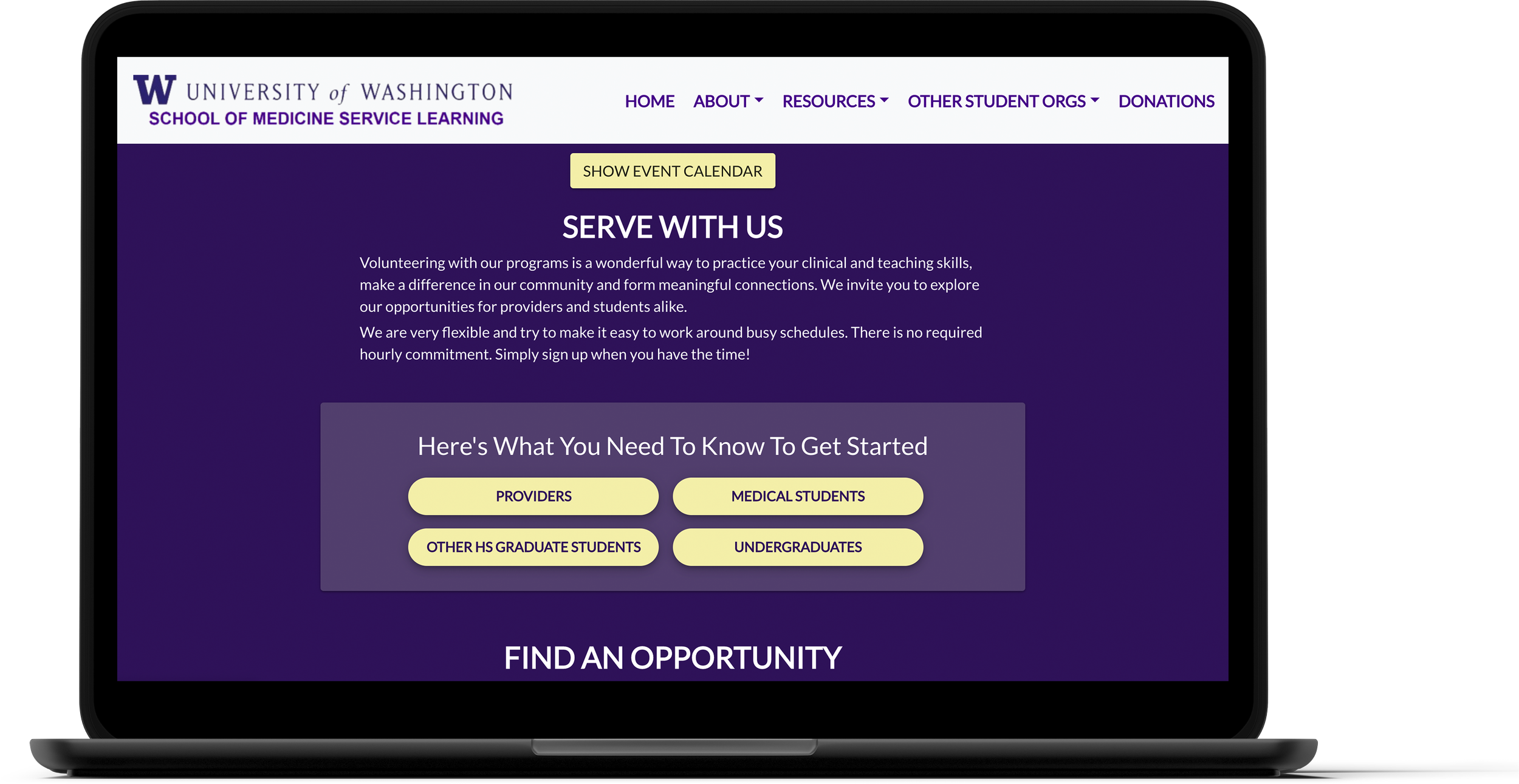
I wanted the homepage to be a place where users can find detailed information relevant to their needs. The addition of the hero provides basic context and a call-to-action that allows returning users to jump straight to opportunities. Further down the page, I increased the organization of the site by linking vital information on how to get involved for the three main user groups of the website: student volunteers, volunteer providers, and potential future community partners and breaks up information based on each user group and their needs. I also added the "Serve With Us" and "About Us" sections to give a first-time user context on how to get involved as well as providing context on the mission of the program.

Newly re-designed homepage providing context to new users and a quick link to opportunities
Putting it together
Since we individually worked on different parts of the flow, we came together to review each other’s screens and create cohesion between our pages. During this time, we made revisions to all pages, but especially on the categories page as it bridged the homepage to the opportunities.
When designing this page, we wanted to ensure a simple process that allowed users to see all the opportunities they were interested in at once, not forcing them to hop between multiple pages. By ideating and adopting a filter system instead of categorical pages, we reduced the number of clicks to view opportunities all on one page. We defaulted the page to show all opportunities for students looking to browse while others could filter by category and student type.
We also made updates to the opportunity pages and modals, to help users better scan information before learning more about the details if they were interested. Finally, to complete the flow, we also created a “provider view” that allows the groups providing these opportunities to view and edit their opportunities to give better information as changes need to be made instead of having to contact the School of Medicine.

Users select their relevant location from the dropdown to see all opportunities.

Users see all the opportunities based on their selected filters.
Completing the website
While the main goal of the site is to provide students with service-learning opportunities, there are auxiliary pages we needed to update as well. These included places for potential providers and community members to learn more about the program as well as for students to find resources while participating in opportunities and even trainings they need to complete before starting.
On top of all of these pages, I got to work on the donations page. This page was especially due for a refresh as donations are a vital part to this program’s success. The original page lacked any context on what the donations would be used for and what work happened on the specific projects you could donate to. This caused people to be hesitant to donate, not knowing what their donations were going towards.
Similar to the home page, my first goal was to add context and imagery to make the page more welcoming, adding a level of human connection to it. I added what the donations would be used for, both for the general fund as well as specific projects and made clear CTAs to drive donations.

New donations page with clear CTAs, context, and imagery

Welcome page for community partners

Onboarding instructions for new volunteer providers

Skills trainings for students interested in certain types of opportunities

Protocols and resources page for students currently in service learning
Working with developers
Throughout the whole process, we met with the developers (also volunteer students) who were working on this project. We had weekly meetings where we would go over our design progress and receive developer feedback on level of effort and feasibility. As we completed pages, we would work with their team to cover any specs they needed or questions they had as they were building each page. As time went on, they would show us the completed pages in their QA environment and asking for our feedback. This feedback loop created a consistently seamless experience and allowed pages to be developed on track for our ideal August 2021 launch of the new homepage and opportunities flow (to coincide with a new initiative the School of Medicine was launching). It also allowed for fast development of the auxiliary pages!
Making service-learning easier for students
Main changes
Scannable Opportunity Pages
The scannable page allows users to find details on opportunities they are interested in helping out with. By making the page scannable with more information, students can make informed decisions before reaching out to the provider for more information and complete any necessary trainings.

Contextualized Homepage
The new homepage creates a welcoming environment that allows returning users to quickly navigate to the listed opportunities while giving new students and others context on what the program is with a chance to learn more.

Driving donations
The new donations page gives donors a look into what the program does, both for the students and for their community. Donations drive this program to new heights and the new page has led to a 6% increase in donations.

See how students get hands-on experience!
Visit the University of Washington School of Medicine Service Learning website to see how our redesign helps students find and gain out of classroom experience!

Reflection
Having reached the end of my time in college, I was thrilled to work on a project that not only broke the rhythm of classes and class projects, but also was impactful to the UW community. Hands-on learning opportunities, such as this one, was an integral part of my learning and development as a designer, so giving back to the UW in a way that helped other students find their own hands-on opportunities was extra special. It was also the first thing I had worked on that I got to see be developed (and really quickly too)! Getting to work on a project outside of the classroom that was publicly available on a website was another sense of accomplishment that helped wrap up my time in college.
Thank you to the UW School of Medicine team for working with us and giving us a chance to better enhance the education of our students!